Join me on Facebook
On facebook I will be sharing portraits, photos, wall hangers, tutorials and more.
Please join me on my facebook fan page and sign up to get updates.
Udsigt photography on facebook
Tuesday, February 16, 2010
Sunday, February 14, 2010
In a snap
Here is a few photos from experiments I have been trying in photoshop during the days with lots of snow and being inside all day. For all of them I used photoshop filters from the alienskin snap art collection.
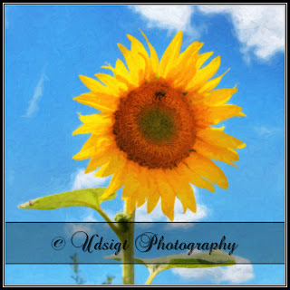
The first one is from the summer/fall time where we went out to an orchard to pick apples. They also had a field of sunflowers and I tried photographing the sunflowers with HDR (taking 5 or so photos at different exposures to widen the dynamic range).
Here I applied a oil paint filter in photoshop (snap art landscape slightly modified).
These next ones are a couple of colorful flowers that I photographed a few years back. I loaded them up in photoshop and applied a snap art oil paint with a color boost to bring out the colors.
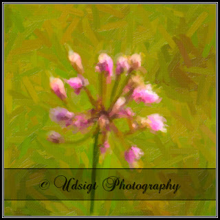
This one is one of the weeds from a field in the Shenandoah mountains. I know... Going to the mountains and I take a photograph of weeds... however this one I applied a snap art oil paint and centered cropped to get a nice even green background and have the colors stand out.
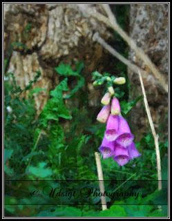
Finally I tried the same snap art oil paint with weeds from Denmark
I think it goes to show that even with some tools that makes the process simple it is possible to get some decent results in a "snap" so to speak.
The first one is from the summer/fall time where we went out to an orchard to pick apples. They also had a field of sunflowers and I tried photographing the sunflowers with HDR (taking 5 or so photos at different exposures to widen the dynamic range).
Here I applied a oil paint filter in photoshop (snap art landscape slightly modified).

These next ones are a couple of colorful flowers that I photographed a few years back. I loaded them up in photoshop and applied a snap art oil paint with a color boost to bring out the colors.
 |  |
This one is one of the weeds from a field in the Shenandoah mountains. I know... Going to the mountains and I take a photograph of weeds... however this one I applied a snap art oil paint and centered cropped to get a nice even green background and have the colors stand out.

Finally I tried the same snap art oil paint with weeds from Denmark

I think it goes to show that even with some tools that makes the process simple it is possible to get some decent results in a "snap" so to speak.
Saturday, January 30, 2010
Three light setup
For the weekend we did have a single portrait shoot setup but due to the snow coming in and road conditions that one got canceled.
We (Emma and I) had been viewing several online videos describing different light setups to create portraits.
One that we liked in particular is The classic three light studio portrait from Pro photo life. Jim Talkington has made several great videos you can find in their video library section.
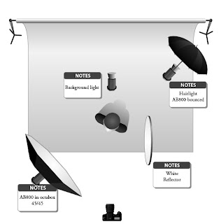
The three light setup we were going to do would be something like illustrated below.
For each step (inspired by the video) we are taking a single shot to show the progress.
First we position the main light to create a Rembrandt style portrait.
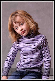
Second we add the reflector on the right side of the subject. After adding the reflector the contrast can be modified by simply turning the main light. If more light fall on the reflector the contrast will decrease. If less light falls on the reflector (or the distance is increased) the contrast is increased.
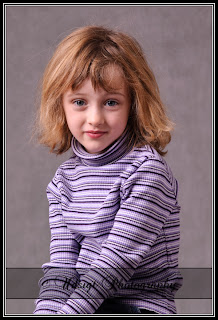
Third we add the hair light opposite the main light also pointing down 45 degrees.
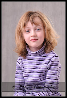
And last but not least we are adding the background light to create separation between the subject and the backdrop. In this case the backdrop is a grayish muslin but it could be a painted wall or paper as well.
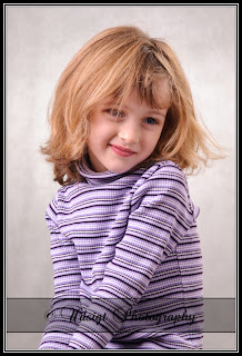
After final light is placed and lights are adjusted the little model of course had to dash off to get a touch of makeup on. So after a good half hour of rummaging around the bathroom I was allowed to take a few more photos.
This setup can be adjusted to fit the subject(s) by fine tuning each light. The setup we did here is pretty sturdy and will give repeatable and consistent results. Now that we have the setup up and running I am planning to put a few markers to indicate where to position the lights in the future making the setup quick to establish next time an opportunity comes knocking on the door :-)
We (Emma and I) had been viewing several online videos describing different light setups to create portraits.
One that we liked in particular is The classic three light studio portrait from Pro photo life. Jim Talkington has made several great videos you can find in their video library section.
The three light setup we were going to do would be something like illustrated below.
- One main light at 45/45 (meaning at a 45 degree angle to the camera and pointing down at a 45 degree angle). This main light will be setup to create Rembrandt lighting.
- One reflector for fill in to minimize the contrast.
- One hair light positioned opposite the main light.
- One background light to create separation between the subject and the background.

For each step (inspired by the video) we are taking a single shot to show the progress.
First we position the main light to create a Rembrandt style portrait.

Second we add the reflector on the right side of the subject. After adding the reflector the contrast can be modified by simply turning the main light. If more light fall on the reflector the contrast will decrease. If less light falls on the reflector (or the distance is increased) the contrast is increased.

Third we add the hair light opposite the main light also pointing down 45 degrees.

And last but not least we are adding the background light to create separation between the subject and the backdrop. In this case the backdrop is a grayish muslin but it could be a painted wall or paper as well.

After final light is placed and lights are adjusted the little model of course had to dash off to get a touch of makeup on. So after a good half hour of rummaging around the bathroom I was allowed to take a few more photos.
 |  |
 | |
This setup can be adjusted to fit the subject(s) by fine tuning each light. The setup we did here is pretty sturdy and will give repeatable and consistent results. Now that we have the setup up and running I am planning to put a few markers to indicate where to position the lights in the future making the setup quick to establish next time an opportunity comes knocking on the door :-)
Labels:
flash,
portrait,
studio,
studio lights,
three light setup
Friday, January 22, 2010
Remember spring?
While organizing photos I found that I am really ready for spring time.
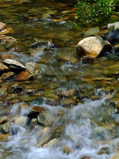
Going back to the mountains and hearing the water in the streams...
Taking a walk in the meadow finding that it's not "just" grass but full of life enjoying the warm sun.
 |  |
 |  |
Spring is when you feel like whistling even with a shoe full of slush. ~Doug Larson
Subscribe to:
Comments (Atom)
